Flutter Tutorials – #1.9 – GridView & SliverGrid (Gallery)
Introduction
Welcome to Himdeve development, where we are preparing the best tutorials to make your mobile app development easier and more efficient.
Goal
- We will create an image gallery
- We will work with GridView and SliverGrid components
- We will go through all the ways to create a GridView – GridView.count(), GridView.extent(), GridView(), GridView.custom()
- We will learn how to retrieve the list of images from the Flutter folder
Procedure
First we open our existing application from the previous tutorial and we open the portfolio_gallery_sub_page.dart file. This will be our entry file for this tutorial.
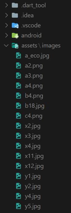
We will create a new assets folder for our application. In it the images folder. And we’ll put a few images in this folder.
In order to get information about these images to our Flutter application, we open the pubspec.yaml file, where we define the assets section in the flutter section and we set the path to the images.
Now we can go back to portfolio_gallery_sub_page.dart file.
We create the _loadImagePaths method to retrieve image paths from the assets/images/ folder.
The AssetManifest.json represents a list of all assets in the application. We load it into the json string – manifestContentJson, using the async-await mechanism and then we make a map – manifestMap out of it using the json.decode command. Subsequently, we select only those assets from the map, which are present in the ‘assets/images/’ folder. Then we return a list of paths to those assets.
Build method
Once we have a list of paths to our images, we can define the build method.
Since the _loadImagePaths method returns a Future object, we’ll use a FutureBuilder, where we’ll define this method in the future attribute.
When data is retrieved, we call the _buildContent method to create a content of this widget. Otherwise, we return the progress bar – CircularProgressIndicator.
GRIDVIEW.COUNT EXPLICIT
CrossAxisCount
First, in the _buildContent method, we return the GridView widget using the GridView.count constructor, which has the required crossAxisCount parameter. This parameter specifies the number of widgets in a row.
MainAxisSpacing
We’ll also set other attributes. The mainAxisSpacing attribute defines the space between rows.
CrossAxisSpacing
The crossAxisSpacing attribute defines the space between the columns.
Padding
We also set a padding attribute that defines a space around our GridView.
Children
Finally, we define the children attribute, in which we insert list of widgets representing images obtained from the assets/images/ folder. We will use the map function to return the _buildImageWidget method with the parameter of the specific path to the image.
Image, ClipRRect, BoxShadow
In the _buildImageWidget method, we return a Container widget, to which we set a decoration attribute. In this attribute we insert a BoxDecoration, in which we define the shadow around the Container using BoxShadow.
BoxShadov has the following attributes:
- color – which represents the color of the shadow.
- offset – here we enter Offset(2, 2), where the first number represents the offset on the x-axis and the second offset on the y-axis.
- spreadRadius – this is the attribute that defines how much the Container should be inflated before using the blur effect.
- blurRadius – defines the amount of blur effect.
Another attribute of BoxDecoration is a borderRadius, by which we define the rounding of our shadow – BoxShadow.
Of course, the Container has a child attribute, into which we insert the Image widget with the path to the image and a fit attribute set to BoxFit.cover.
We wrap this Image widget in the ClipRRect widget so that we can round the corners of our images with the borderRadius attribute.
GRIDVIEW.EXTENT EXPLICIT
Another GridView constructor is GridView.extent, which has the required maxCrossAxisExtent attribute, which represents the maximum extent of widgets in the cross axis.
The difference between GridView.count and GridView.extent is that in GridView.count we define the number of widgets per line. So even if we rotate the device horizontally, widgets may increase theirs size, but the number will stay the same. For GridView.extent we set the extent. This means that when we rotate the device horizontally, the size of the widget is more or less kept, but the number of widgets per line increases. With the GridView.extent constructor a layout is responsive.
GRIDVIEW EXPLICIT EXTENT DELEGATE
The GridView.extent constructor like GridView.count constructor is just a simplified form where we do not need to define delegates for GridView. They are defined in the background automatically.
However, there is an option to define delegates to GridView. For that we use the GridView() constructor, which has the required gridDelegate attribute. For example, we can put SliverGridDelegateWithMaxCrossAxisExtent in this attribute, which is actually used for the GridView.extent constructor automatically.
GRIDVIEW EXPLICIT COUNT DELEGATE
We can also change the GridView.count constructor to the GridView() constructor. For that we put the SliverGridDelegateWithFixedCrossAxisCount to the required gridDelegate attribute. This mechanism is automatically used for GridView.count constructor in the background.
GRIDVIEW BUILDER EXTENT DELEGATE
So far, we have defined an explicit list of items. However, if we want to build items as we scroll, which is, of course, more efficient, we can use the GridView.builder constructor.
This constructor has again the required attribute gridDelegate, in which we put the SliverGridDelegateWithMaxCrossAxisExtent.
And a required itemBuilder attribute that returns the index of the displayed item on which we dynamically create the widget.
We also define an itemCount attribute, which represents the total number of items, which we want to dynamically create.
GRIDVIEW CUSTOM EXTENT CHILDREN EXPLICIT DELEGATE
The last GridView constructor is GridView.custom, which has 2 required attributes. Both of these attributes are delegates.
The GridDelegate is a delegate that controls the layout of the children within the GridView.
And the childrenDelegate is a delegate that provides the children for the GridView.
For example, SliverGridDelegateWithMaxCrossAxisExtent with the required maxCrossAxisExtent attribute can be set for the gridDelegate attribute. As well as the SliverGridDelegateWithFixedCrossAxisCount with the required crossAxisCount attribute.
For childrenDelegate we set the SliverChildListDelegate, that explicitly defines its children.
GRIDVIEW CUSTOM EXTENT CHILDREN BUILDER DELEGATE
Again, if we wanted to make this process more efficient and create children during scrolling to save memory, we could set the SliverChildBuilderDelegate for the childrenDelegate attribute.
SLIVERGRID
The GridView widget is useful if we don’t work with multiple sliver-widgets. However, if we need to define another sliver in the CustomScrollView widget, for the slivers attribute, we must use the SliverGrid widget instead of GridView.
In our case we have a SliverAppBar that works with GridView only because we use the NestedScrollView widget. However, we will show an example how we can define a SliverGrid to get the same effect as the GridView widget if we have only a CustomScrollView widget and not any NestedScrollView widget.
The SliverGrid is very similar to the last GridView.custom constructor.
It also has 2 required attributes. The first is gridDelegate, which works exactly the same way. And the second is a delegate that works just like childrenDelegate for the GridView.custom constructor.
This time, however, the SliverGrid has no padding attribute.
To add SliverGrid to our class, we need to modify the build method.
We will wrap the _buildContent method in the CustomScrollView widget, where we define the sliver widget list for the slivers attribute. We put to this list the _buildContent method, which returns the SliverGrid widget.
To achieve the desired padding, we again wrap this method with another widget and this time it will be a SliverPadding widget to which we set the desired padding.
Conclusion
And with this is our ninth part of this first series of Flutter Tutorials completed and of course you can find the complete source code on the githube.