Flutter Tutorials – #1.6 – SliverList
Introduction
Welcome to Himdeve development, where we are preparing the best tutorials to make your mobile app development easier and more efficient.
Goal
- Create a SliverList widget for the Portfolio screen containing a list of tutorials consisting of an image url and a title
- We will learn how to work with slivers – SliverList and SliverFixedExtentList
- We will explain the meaning of sliver delegates
- We will add a new Tuple class
- We will learn how to work with the Card widget and build a nice UI
Procedure
First we open our existing application from the previous tutorial and we open the pubspec.yaml file.
Tuple
To define a list of constants with values representing the url of the tutorial image url and its title. We will use the Tuple class which allows an easy manipulation of two or more objects. However, we must first add it to our pubspec.yaml file.
Then we open the file portfolio_page.dart. And in the PortfolioPage class, we define the list of constants using the Tuple2 class, which can pass exactly 2 objects. We will create a constant tutorials and define there the 6 of our tutorials. Specifically, the url of the image representing the tutorial and its title.
SliverList
In the build method, specifically in the Scaffold widget, the CustomScrollView widget is defined for the body attribute. This widget has a slivers attribute that is currently populated with two widgets – the SliverAppBar and the SliverFillRemaining widget.
In this tutorial, we will replace the SliverFillRemaining widget with a SliverList widget.
So we remove the SliverFillRemaining widget and also the _buildContent() method.
And instead of the SliverFillRemaining widget in this sliver list, we add the SliverList widget.
Why do we even use the SliverList widget instead of the classic ListView widget?
If we only want to scroll through a list of objects, ListView is the ideal component. However, if we want to create more complex scrolling effects like, in our case, to have a collapsing toolbar (SliverAppBar) with a scrolling list of items, we need to use the SliverList widget.
As the slivers can create each item by lazy loading as we scroll, which is very efficient, they need to define a delegate attribute that directly provides items from a our list to render a particular view while scrolling.
SliverList delegate
Therefore, we define a required delegate attribute for the SliverList widget and we insert the SliverChildBuilderDelegate into it. We can also include other objects, such as SliverChildListDelegate, where we would only explicitly define a widget-child list. However, SliverChildBuilderDelegate makes it possible to create this child-widget list on demand, means lazily, which makes the whole process more efficient.
SliverChildBuilderDelegate
SliverChildBuilderDelegate has the BuildContext and index arguments, where index represents the index of the item while scrolling.
With this callback method we will return the widget-children to the sliver list. In this case we will create a private _buildListItem method for this purpose, which will return a specific item from our tutorial list.
SliverChildBuilderDelegate has a childCount attribute where you define the exact number of items.
Card
To make our item look graphically nice, we return the Card widget in the _buildListItem method to create a material design card.
The widget Card has a margin attribute where we set the margin to 5 for all sides.
And then we set the child attribute into which we insert the Row widget.
Row – mainAxisAlignment a crossAxisAlignment
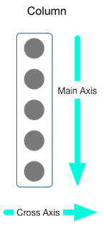
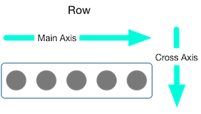
Row and Column widgets have the mainAxisAlignment and crossAxisAlignment attributes to control the alignment of Row or Column widgets.
For a row widget, the main axis runs horizontally and the cross axis runs vertically. For the Column widget, the main axis runs vertically and the cross axis runs horizontally.
source: https://flutter.dev/docs/development/ui/layout
So we define the crossAxisAlignment attribute for Row widget and set it to CrossAxisAlignment.start, so that its widget-children are aligned to the top.
Another attribute for a Row is the children attribute, which represents the widget list in this widget hierarchy.
Image
We define here an Image widget, into which we insert the NetworkImage provider with the url of the image for the particular tutorial. We can get this url by using the Tuple variable item1, which represents the first item in this object.
In our case, this image is too large, so we set the scale attribute to 12.
The next item in the Row widget will be the title of the tutorial, which we insert into the Text widget and set the font size to 20 and font style to bold. We will wrap it with the Padding widget and set the desired padding.
Expanded
Finally, we’ll wrap it in the Expanded widget. Because in our case the text is too long to fit on the device screen. This causes the yellow-black striped pattern to be displayed along the affected area. So in our case on the right side. Therefore, widgets can be customized to fit into a Row or Column using the Expanded widget.
SliverFixedExtentList
If we want to set the same height for each item widget, we can use the SliverFixedExtentList widget instead of the SliverList widget and define the height using the itemExtent attribute.
Conclusion
And with this is our sixth part of this first series of Flutter Tutorials completed and of course you can find the complete source code on the githube.